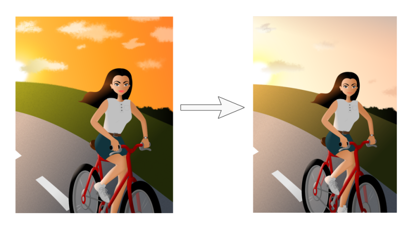
Last year, in the end of the August, I made this picture where the girl is riding with bicycle and in the background there is a sunset. I remember I wanted it look like these wonderful warm summer evenings, but later I wasn’t satisfied with the result. It’s not surprising if you look this bright orange sky. It may go with some exotic sea or beach, but in my picture it seems too much. Therefore, few days ago I experimented with colours and this is result:
In my opinion it looks way better than last one. What do you think? Is the new look better or you prefer the old version? 🙂

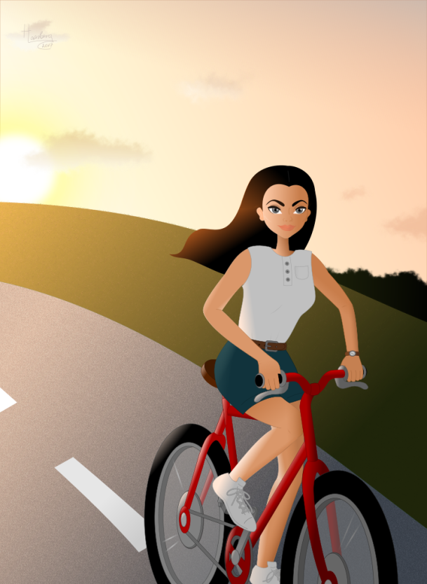
Yes – the second one is much better, the darker one, in my opinion was way too intense for a sunset. Sunsets, for me evokes a feeling of winding down, coolness, which I think you’ve captured beautifully in your second image. Well done.
LikeLiked by 1 person
Yes, intense! That is exactly the right word to describe the first one.
Thank you very much for your comment, Dina. 🙂
LikeLiked by 1 person
The second one is a case of ‘less is more’ – both in the delicate sunset being actually more attractive, and in the colours not overpowering the girl in the foreground. Nice revision!
LikeLiked by 1 person
I’m glad you like the revision, Eleanor! And thank you so much for your comment. 🙂
LikeLike
Yes. The contrast between the background and foreground in the second picture is much greater than in the first, which you can clearly see when you desaturate the images. (Which is a nice exercise to see if values in your image are correct.) Also, such a warm color in the background attracts the attention of the viewer too much, leaving less for the girl. Lovely sunset!
LikeLiked by 1 person
I haven’t thought about desaturating images to see the contrast. Thank you for the advice, Dorit! You are really great person, I’m so glad I have met you. 🙂
LikeLiked by 1 person
You’re welcome, Hanna! You’re a pretty fabulous person, too 🙂
LikeLiked by 1 person
Tough choice! I really like the warm feeling of the first one – the fire ball vibrance of the sky and lipstick. But the second one is probably more realistic and it does give that sense of the air cooling down at night. I looked at a bunch of pictures of people and sunsets and in the ones with orange skies, the people were quite dark. The setting sun photos where I could still see the people’s details had skies like in your second photo. I do occasionally see fireball sunsets here but mostly, if I think about it, sunsets are more subdued, like in your second photo. The colour variation in your second sky is lovely. 🙂
LikeLiked by 1 person
The one thing I love about art is that it doesn’t need to be realistic. Therefore, as the fireball sunsets are less common than subdued fireballs, we should draw them often. 😀
But I must admit that colours are very sophisticated subject. I usually experiment large number of different colours when making a drawing and even when I finally choose the right palette, I end up with several versions of one picture and I can’t decide which one is better. The variations are usually so little, that I believe other people doesn’t even tell the difference, but for me, it causes so much anxiety. 😀
Computer monitors are other thing that causes confusion. As you wrote below the first version of this picture: “…computer screens and their settings make a huge difference to how a picture looks!” Sometimes I finish the picture and think it’s great and then I look it from another screen and despair. 😀
In conclusion, colours are difficult matter to me. I’ve thinking about taking some art classes to study colours and light and shadow. Maybe it can help me bit. 🙂
Sorry for long response and I thank you again for your analytical comment, Myriam! 🙂
LikeLiked by 1 person
Haha! I totally know what you mean about the anxiety about small colour differences! I experience that sometimes when I edit photos. My solution is to just pick one because, well, the difference is small!
I’ve noticed that when Ann Christina digitizes her watercolours she sometimes creates a warm and a cold version. I think one of the cool things about digital drawing is that one drawing can be coloured in more than one way. But if you have to pick just one… Sometimes it is easy and sometimes it isn’t.
Art classes are always helpful. I was thinking of taking a online class for painting birds using different techniques. I need help with choosing colours and mixing them and more techniques means more skills and more options! Not sure when I will get around to it though!
As for computer screens, I’ve decided that if a photo looks good on my iPhone and MacBook, it is perfect! I like how glossy those screens are. 🙂
Do you see auroras borealis in Estonia? I saw my first one on Saturday night from my balcony. So cool! I didn’t get any good photos though. I haven’t tried night photography yet.
LikeLiked by 1 person
I guess you’re right – just pick (randomly) one picture, because the difference really is small. 😀
I’ve heard (and Internet confirmed it) that sometimes you can see aurora borealis in Estonia, but regretfully I haven’t been so lucky yet. I found this Facebook group, where people can post photos about aurora borealis they’ve seen in Estonia and also write when and where there may be chance to see them. It’s interesting and may be can help me see one soon. 🙂
You should definitely try night photography! I believe you would be great. 🙂
LikeLiked by 1 person
My husband gets aurora alerts from this website called aurorawatch. He was in Ontario that night and he called me and insisted that I stay awake until I saw the aurora. That was the only reason I went on my balcony at midnight. And there it was! Some people go out at 2, 3 or 4 am to see them but I’m not that motivated.
I looked up photos of auroras in Estonia. Lots of pretty ones. I hope you get to see one! 🙂
LikeLiked by 1 person
I also like the new one better. I once read in a book that it´s good to have just one or a few “leading” (intense) colors and to keep the rest rather pale. The leading colors should highlight the important parts of the picture… I think this is really true, and your picture shows that perfectly. But I know what you mean – for me finding the right colors is kind of the hardest part in painting…
LikeLiked by 1 person
Yes, in the first picture the bright orange sky takes all the attention away from the girl. And there was too little contrast.
As you may see, then choosing the right colours is really difficult for me either. I tend to use too dark colours. I’m glad I got some great advice from Dorit in the comments above, who said that desaturating images is a nice exercise to see if values in the image are correct. And the suggestion about having one or few leading colour is also very helpful. Thank you! 🙂
LikeLiked by 1 person